DCShoesUSA Product Poster Design
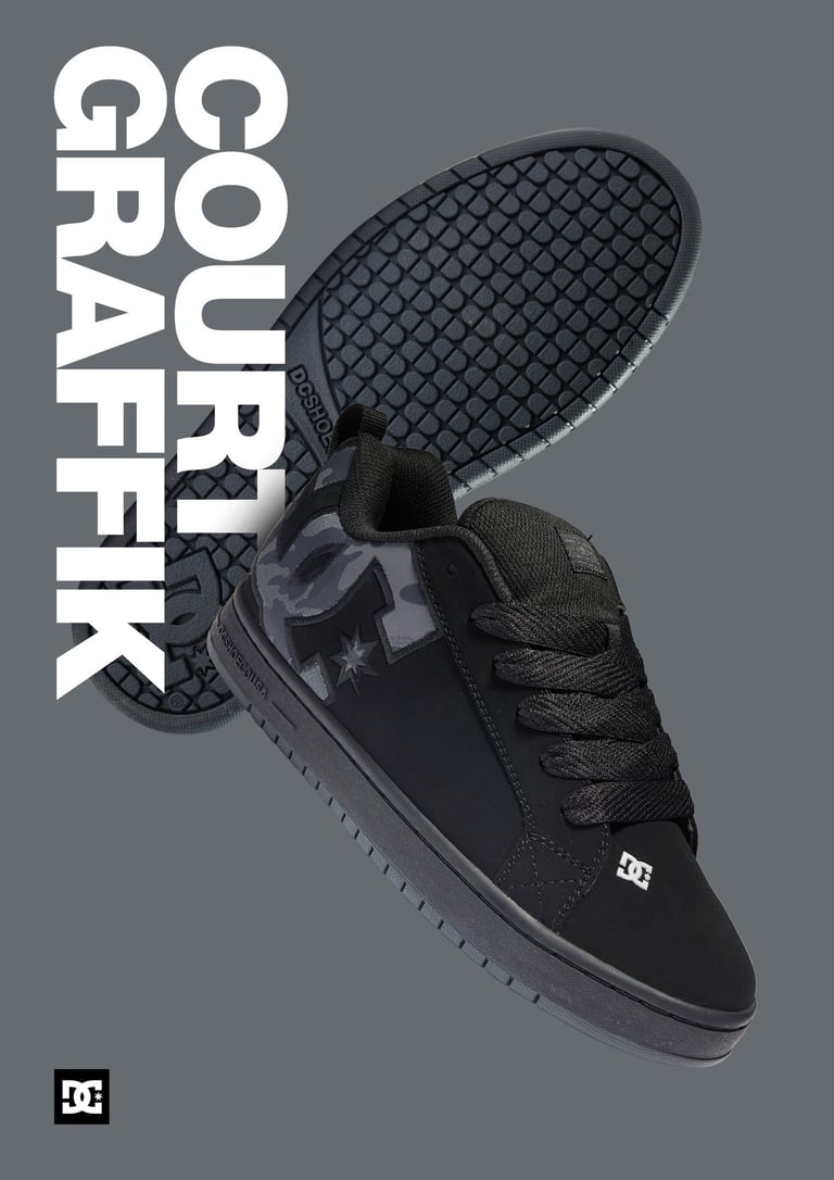
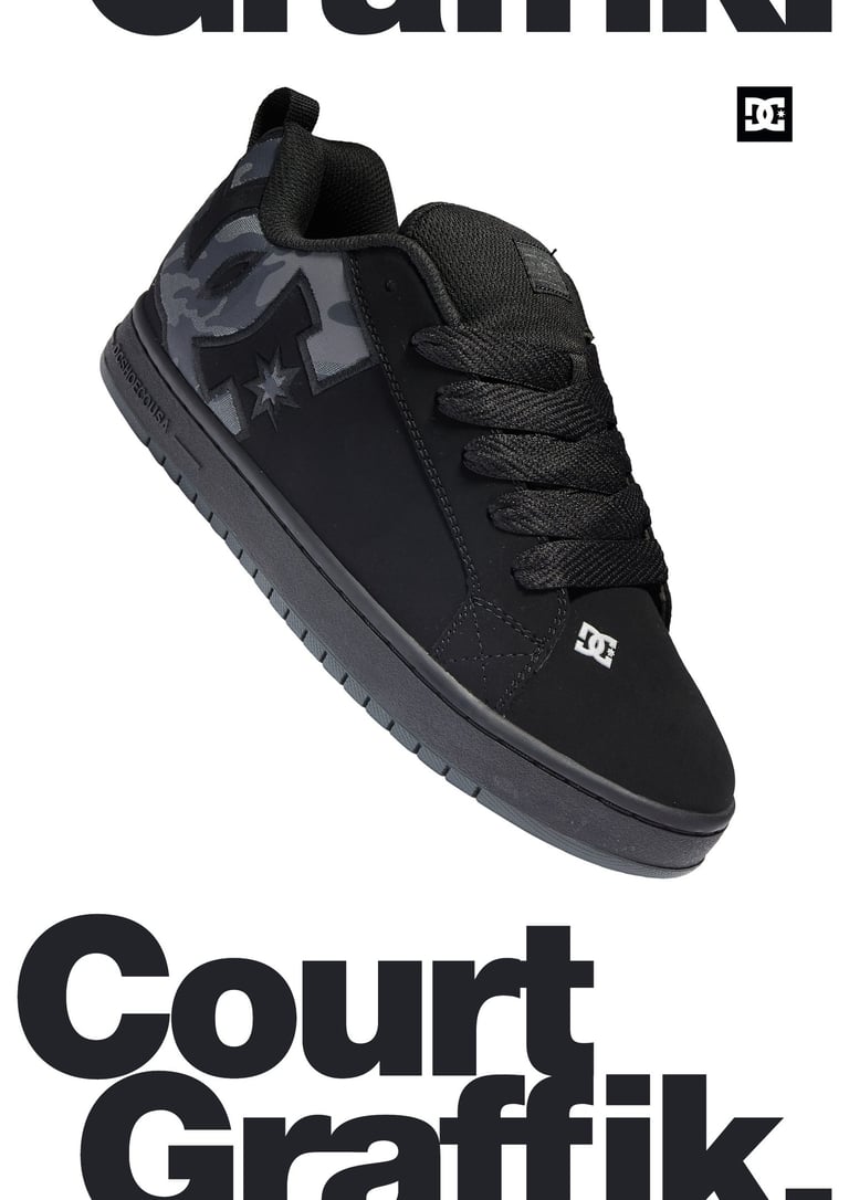
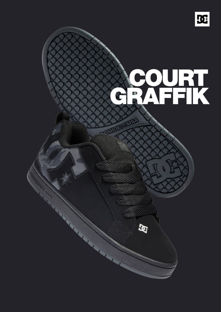
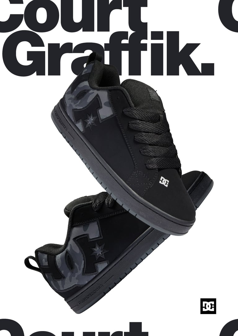


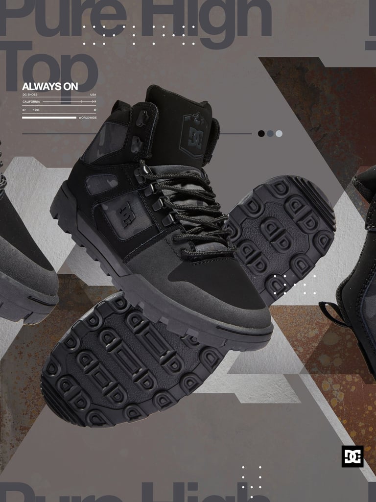
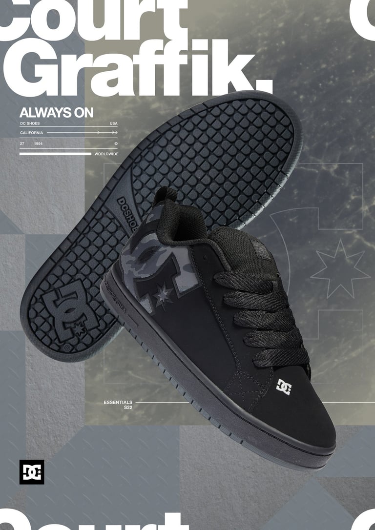
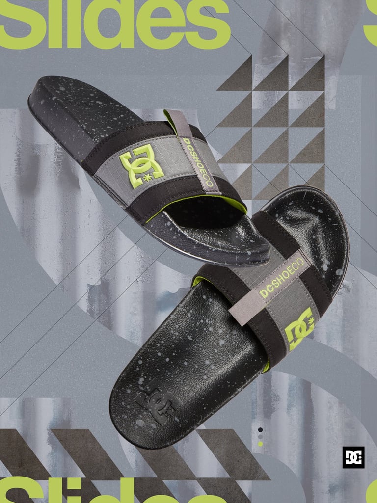
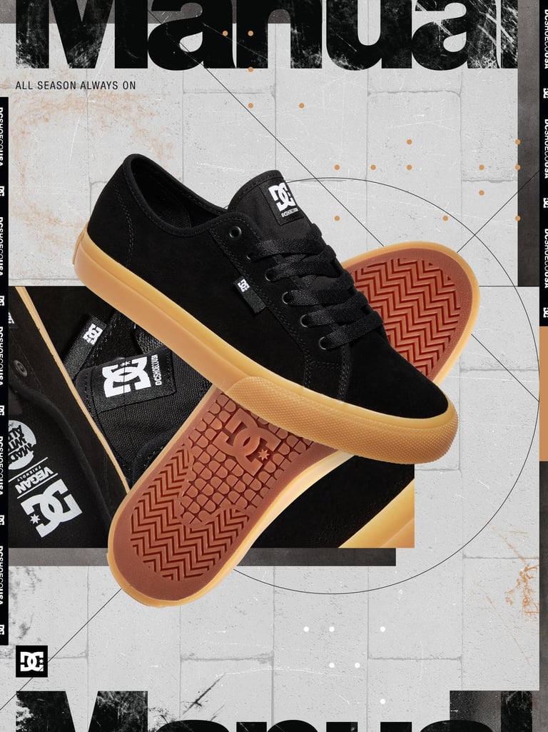
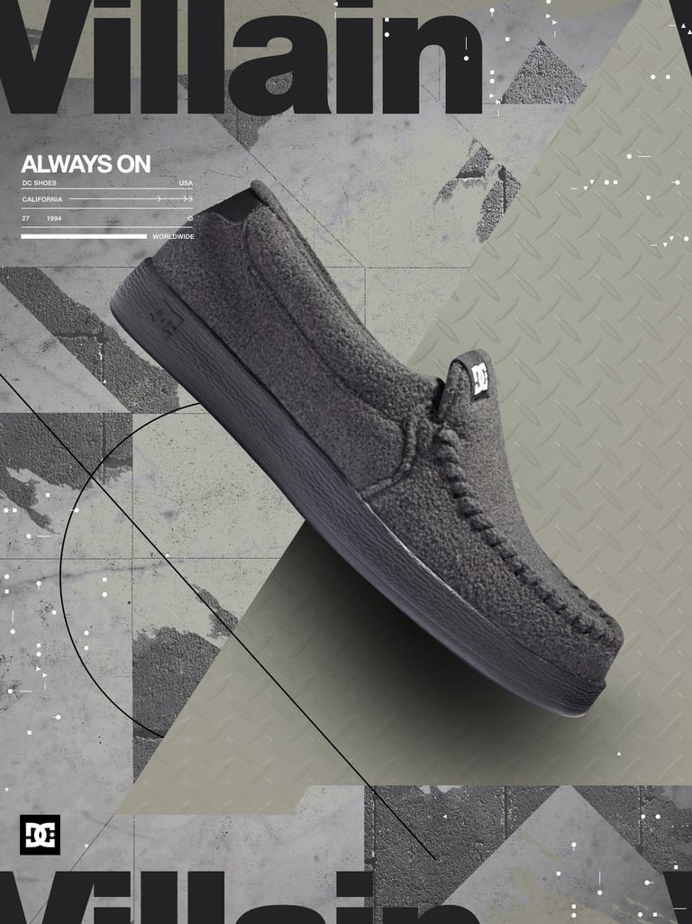
I was reached out by DCShoes USA to work on their summer campaign and create 5 posters for each of their footwears
They had shared the moodboard and a brief with me on the visual direction they wanted to go in, along with this there was also some texture photography which was their brand textures which are used in their product photography. I had to also find a way to incorporate that into the designs as well.
About
Phase 1 -Typography
My Aim with these designs is to create a clear hierarchy and these are some base compositions. I did this soo that we can spend more time on the compositions that you like, and not spend time designing around other compositions.
I tried creating the system is to use the same position of the typography, sneaker & logo across all five posters and change the underlying designs for all the 5 footwears, that way they will seem as part of a series but different.
Phase - 2 Design
With the client having chosen the direction for the base design we started to design. They also wanted to use 2 images of the footwear for each poster.
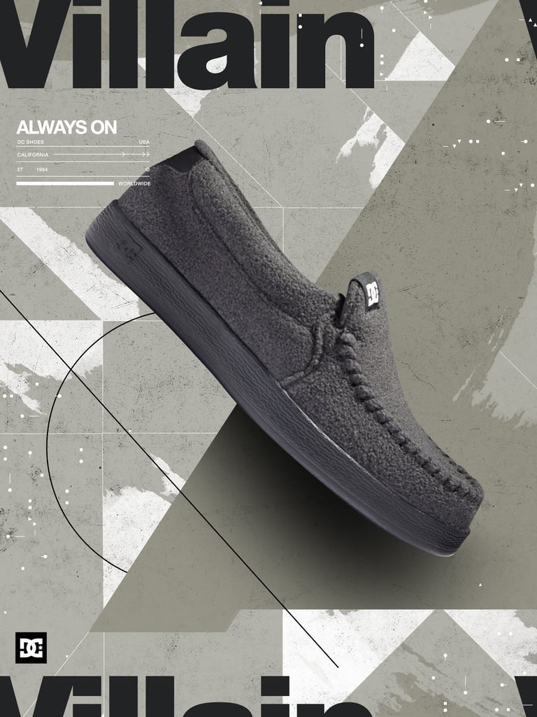
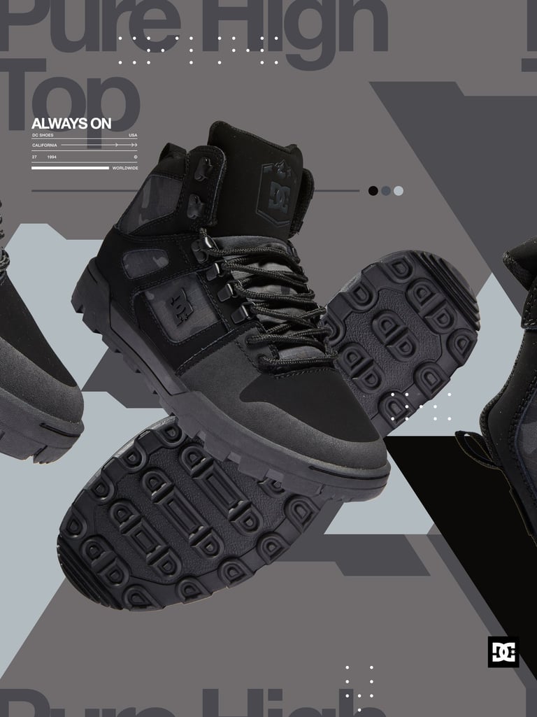
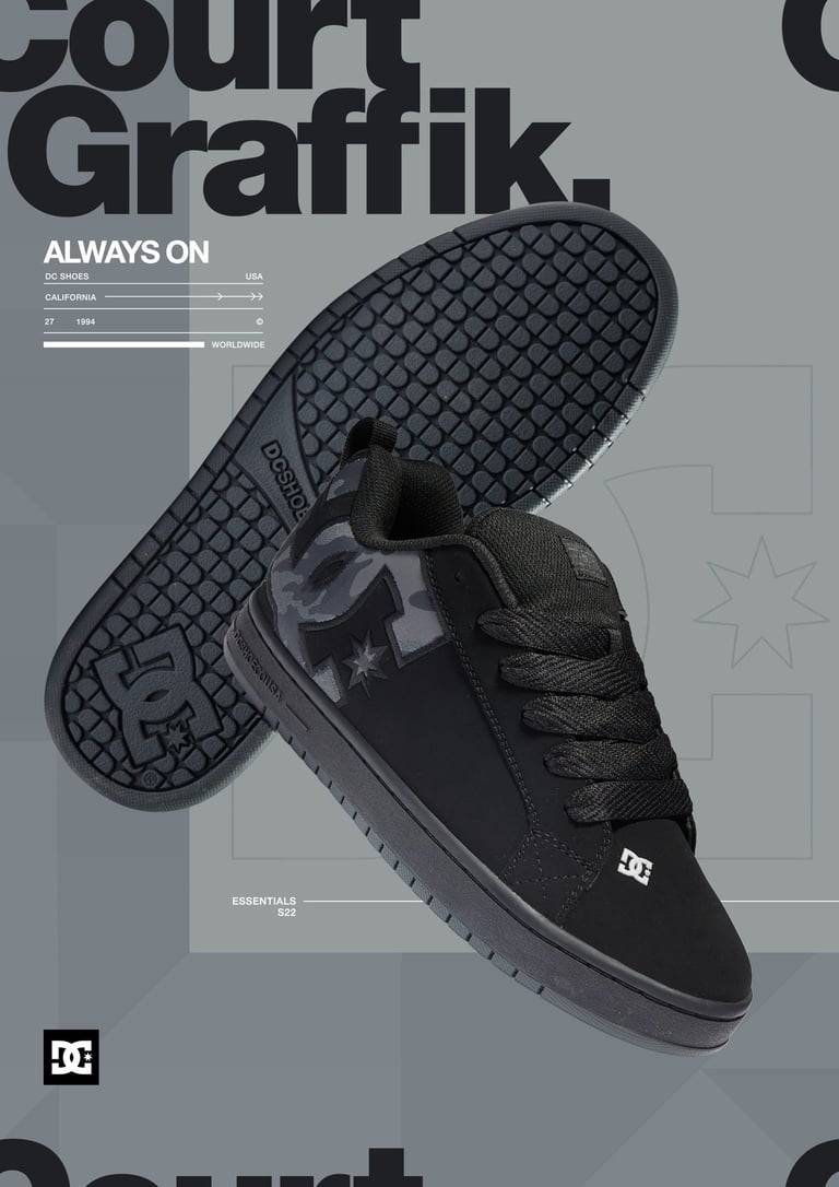
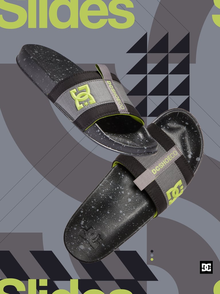
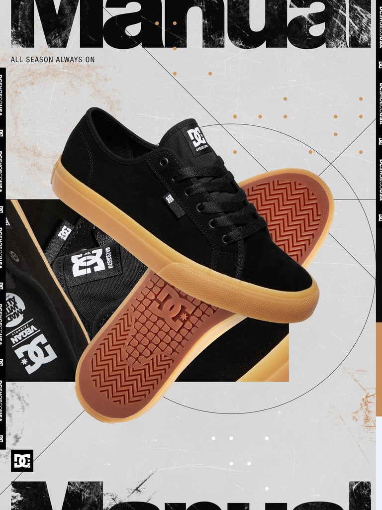


In the next stage we added the brand textures.


If you want to take your product visuals to another level, get in touch with me through email or contact form.
Contact@bacosil.com


LET'S GET
STARTED
You can contact me by submitting the form or email me directly.

TIME ZONE
India GMT (+5:30)
Flexible +/- 3 Hours


